By Byeonghwa Jeong, Karen Chapple & Jeff Allen
On this website, we’ve tracked post-pandemic recovery patterns in the downtowns of many North American cities, based on location-based mobility data from cell phones supplied by Spectus. While we’ve compared recovery across different cities, as well as created a tool to explore how results vary for different definitions of downtown, policymakers often need more fine-grained data to determine how recovery is progressing at the city block or individual building level.
On this page, we examine recovery rates (comparing activity in Spring 2023 to Spring 2019) for 119 buildings located in the Toronto Financial District Business Improvement Area (BIA). Most buildngs in this BIA are either office (45%), mixed-use office plus retail (33%), or retail only (11%) buildings. The map below reveals substantial variation in recovery across the area. The darker the red, the lower activity in 2023 compared to 2019, and the darker the blue, the higher the rate of recovery.
Toronto Financial District BIA
Recovery Rate % (2023 versus 2019)50%70%90%110%130%150%Building with low sample, treat result with caution
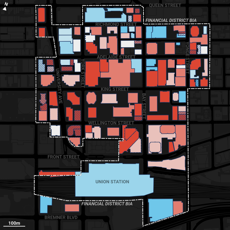
Specifically, to estimate the recovery rate of each building, we counted the total unique daily visitors from March to May 2023, dividing it by the total unique daily visitors in corresponding months in 2019. Before dividing, both totals were normalized by the total number of unique devices in the City of Toronto, to account for changing sampling rates over time. For both time periods, the average daily sampling rate was in the range of 1-2% of the overall population. For more details on how we are measuring recovery from Spectus data, view our methodology page.
The building that recorded the highest rate of change was CIBC Square Phase I with 3026% followed by Wildeboer Dellelce Place and the building at 9 Temperance St (369% and 344% respectively). In the case of CIBC Square, it was under construction in 2019 and opened in 2021. It also has a regional bus terminal on its ground floor.
Recovery Rates By Building Type
Below we create dot distribution charts of building recovery rates by the four most prominent building types. Each dot represents a single building, placed on the X-axis pertaining to its recovery rate. The data on building type was provided by the Financial District BIA.
The vast majority of office and retail buildings have not recovered to their pre-pandemic level of activity, likely due to hybrid work arrangements. While there are only 8 hospitality buildings in the district, 6 of them have a recovery rate of more than 100%, indicating a strong return and increase in activity in hotels and related establishments. Office Buildings Median Recovery Rate = 69%Recovery Rate 0% 100% 200% 300% 400% Retail Buildings Median Recovery Rate = 55%Recovery Rate 0% 100% 200% 300% 400% Mixed Office & Retail Buildings Median Recovery Rate = 56%Recovery Rate 0% 100% 200% 300% 400% Hospitality Buildings Median Recovery Rate = 133%Recovery Rate 0% 100% 200% 300% 400%
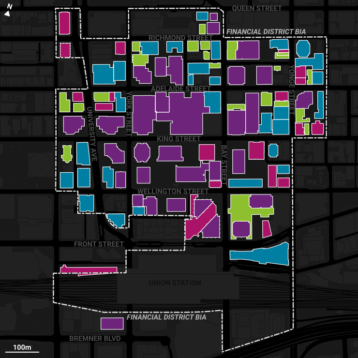
Cluster Analysis
Based on the recovery rate results, we conducted a clustering analysis to identify building typologies related to their recovery rates and other attributes such as building type (e.g. retail, office, etc.), building class (A, B, or C, which is a ranking of building quality, often reflective in rental rates) and usable space of the building (i.e. the total floor area to account for different building sizes). Specifically, we ran a cluster analysis that’s a combination of Gower’s distance and k-medoids method on all office, retail, and mixed use office/retail buildings in the district. The categorical variables were converted to dummy variables (0 or 1) and the numeric variables on usable space and recovery rate were log scaled and normalized to a range from 0 to 1 prior to clustering. The number of clusters was based on analyzing the within-cluster sum of squares.
Based on our analysis, we find that there are 4 clusters (i.e. types) of buildings. Generally, Class A buildings and large-size office and retail mix-used buildings tend to have lower recovery rates, whereas smaller-sized Class B and C office and retail buildings show higher recovery rates. High Recovery, Class B & Cn = 22Recovery RateUseable SpaceClass AClass BClass COfficeRetailOffice & RetailModerate Recovery, Office & Mixed-Usen = 30Recovery RateUseable SpaceClass AClass BClass COfficeRetailOffice & RetailLow Recovery, Class A & Retail Mixn = 32Recovery RateUseable SpaceClass AClass BClass COfficeRetailOffice & RetailVery Low Recovery, Class Bn = 20Recovery RateUseable SpaceClass AClass BClass COfficeRetailOffice & Retail
Below is a map of the cluster results. A large number of buildings were identified in the third cluster, predominantly Class A mixed-use buildings with lower recovery rates, which we see are located in the centre of the BIA. These buildings make up most of the tall skyscrapers in the district. Buildings in the other clusters are scattered more around the periphery of the BIA.
It is our hope that based on this typology, policy-makers and related stakeholders can see how different types of buildings are recovering more than others, and can design effective recovery strategies based on building-level attributes.
While our analysis was focused on Toronto’s downtown, the same type of analysis could be applied to other areas as well that have building level data or other sub-geographies (e.g. sets of city blocks, BIAs, neighbourhoods) with distinct characteristics. If you’re interested in seeing something similar for your city or neighbourhood, please reach out to us!